Le Activity Neun

For the video processing activity, we chose to verify the dependence of the motion of a rolling cylinder on the angle of incline of the ramp it is on. We took multiple takes of the rolling cylinder for different inclination angles. In the next figure, I show frames extracted from the video and their corresponding results from image segmentation.

Figure 1. (top four) Frames taken from the video. The rolling cylinder is seen to be at different parts of the ramp. (bottom) The corresponding results of image segmentation of the rolling cylinder.

Knowing the dimensions of the ramp, I use dimensional analysis to convert the pixel distance to actual distance. And knowing the frame rate of the camera and the total number of frames, I can calculate the sampling time. Using each segmented image, I take the average of the x and y position of each pixel with a HIGH state to simulate a point mass in motion. The next figure will show the displacement vs. time plot for different heights (inclination angle).

xvt

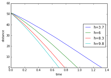
Figure 2. A plot of the measured distance covered by the rolling cylinder. Distance is in units of cm.

We expect that the cylinder will fall faster at a higher inclination height which is shown by h=9.8cm. Due to gravitational acceleration, we also expect a concave downward parabolic behavior for distance. Calculating for the derivative by taking the point-by-point difference, I get the following plots for velocity and acceleration.

vvt

avt

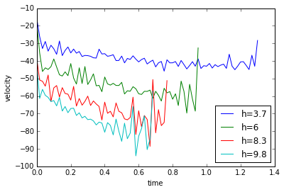
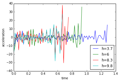
Figure 3. (top) Plot of the velocity of the rolling cylinder and (bottom) plot of the translational acceleration of the rolling cylinder.

The calculated data is noisy but qualitatively we can say that the velocity is linear and sloping downwards while the mean of the acceleration is almost constant, which is the expected output. Better results might be calculated by fitting a line in the velocity data and taking its slope to get the acceleration.

For this activity I will give myself a score of 8 for bad quality of the presented data. For this activity, I acknowledge Ron-sama for helping me with the video parsing and the segmentation. Here is the python code I used for the activity.

# -*- coding: utf-8 -*-

“””

Created on Mon Nov 30 14:12:26 2015

@author: jesli

“””

from __future__ import division

import numpy as np

import matplotlib.pyplot as plt

import matplotlib.cm as cm

import Image as im

fps=60.

t1=np.arange(0,80/fps,1/fps).tolist()

t2=np.arange(0,59/fps,1/fps).tolist()

t3=np.arange(0,48/fps,1/fps).tolist()

t4=np.arange(0,43/fps,1/fps).tolist()

conv=0.0502

#plank width = 16.3

#0.0502cm/pixel conversion

ht=[3.7,6,8.3,9.8]

theta=np.arctan(np.array(ht)/109)

number_1=(np.asarray(range(80))+120).tolist()

number_2=(np.asarray(range(59))+97).tolist()

number_3=(np.asarray(range(48))+98).tolist()

number_4=(np.asarray(range(43))+127).tolist()

ys_overlay=[]

for h in ht:

ys=[]

vs=[]

if h==3.7:

for number in number_1:

filename=”h=”+str(h)+”/segmented”+str(number)+”.jpg”

cap=np.asarray(im.open(filename))

[x_obj,y_obj]=np.where(cap==255)

y_ave=np.average(y_obj)

ys.append(y_ave)

# if

if h==6:

for number in number_2:

filename=”h=”+str(h)+”/segmented”+str(number)+”.jpg”

cap=np.asarray(im.open(filename))

[x_obj,y_obj]=np.where(cap==255)

y_ave=np.average(y_obj)

ys.append(y_ave)

if h==8.3:

for number in number_3:

filename=”h=”+str(h)+”/segmented”+str(number)+”.jpg”

cap=np.asarray(im.open(filename))

[x_obj,y_obj]=np.where(cap==255)

y_ave=np.average(y_obj)

ys.append(y_ave)

if h==9.8:

for number in number_4:

filename=”h=”+str(h)+”/segmented”+str(number)+”.jpg”

cap=np.asarray(im.open(filename))

[x_obj,y_obj]=np.where(cap==255)

y_ave=np.average(y_obj)

ys.append(y_ave)

ys=np.asarray(ys)*conv

ys_overlay.append(ys)

#differentiate!

d1=[]

for i in range(len(ys_overlay)):

final=np.roll(ys_overlay[i],-1)

initial=np.asarray(ys_overlay[i])

diff=((final-initial)*60).tolist()

del diff[-1]

d1.append(diff)

plt.figure(1)

plt.plot(t1,ys_overlay[0],label=’h=3.7′)

plt.plot(t2,ys_overlay[1],label=’h=6′)

plt.plot(t3,ys_overlay[2],label=’h=8.3′)

plt.plot(t4,ys_overlay[3],label=’h=9.8′)

plt.xlabel(‘time’)

plt.ylabel(‘distance’)

plt.legend(loc=5)

del t1[-1]

del t2[-1]

del t3[-1]

del t4[-1]

#differentiate again!

d2=[]

for i in range(len(d1)):

final=np.roll(d1[i],-1)

initial=np.asarray(d1[i])

diff=((final-initial)).tolist()

del diff[-1]

d2.append(diff)

plt.figure(2)

plt.plot(t1,d1[0],label=’h=3.7′)

plt.plot(t2,d1[1],label=’h=6′)

plt.plot(t3,d1[2],label=’h=8.3′)

plt.plot(t4,d1[3],label=’h=9.8′)

plt.xlabel(‘time’)

plt.ylabel(‘velocity’)

plt.legend(loc=4)

plt.show()

del t1[-1]

del t2[-1]

del t3[-1]

del t4[-1]

#translate to g

all_ave=[]

for i in range(len(d2)):

ave=np.mean(d2[i])

all_ave.append(ave)

lst=d2[0]+d2[1]+d2[2]+d2[3]

ave=np.mean(lst)

#calc g

g=[]

for angle in theta:

G=ave/np.sin(angle)

g.append(G)

plt.figure(3)

plt.plot(t1,d2[0],label=’h=3.7′)

plt.plot(t2,d2[1],label=’h=6′)

plt.plot(t3,d2[2],label=’h=8.3′)

plt.plot(t4,d2[3],label=’h=9.8′)

plt.xlabel(‘time’)

plt.ylabel(‘acceleration’)

plt.legend(loc=4)

plt.show()


Le Activity Sechs

Properties and applications of the 2D Fourier Transform. We start with the anamorphic properties of the fourier transform. I genereated the following patterns:

Figure 1. (top left) Dots along the x-axis, (top-right) dots along the x-axis with larger spacing, (bottom-left) tall rectangle, (bottom-right) wide rectangle.

Taking their Fourier transforms, I get:

Figure 2. Corresponding Fourier transforms of the patterns in figure 1.

Anamorphism in the fourier transform is basically described in the scaling property in fourier transforms which says that a signal multiplied by some constant implies a division by the same constant in the frequency space. Basically it says that the smaller the spatial pattern, the higher spatial frequency it will occupy. This can be seen in the rectangular patterns where the axis with a thinner window produces a fourier transform with peaks occupying the higher frequencies.

For the rotation of the FFT, I generated the following synthetic images:

Figure 3. Corrugated roof patterns with different frequencies and their Fourier transforms

The change in sinusoid frequency displays anamorphism seen when the dots in the fourier space are farther apart for the tightly packed corrugated roof. Adding a bias to the sinusoid to simulate a real image, we get the a peak in the center as shown in the next figure. The next figure also shows the effect of rotation in the spatial domain to the resulting spatial domain.

Figure 4. (left) Central peak in frequency domain due to bias, (top-right) rotated sinusoid pattern, (bottom-right) fourier transform of rotated pattern.

The images in the right side of figure 4 show the effect of rotation in the spatial domain to the resulting fourier transform. It can be seen that a rotation in the pattern will also create a rotation in the fourier transform. Here is another example:

Figure 5. Rotation of a combination of sinusoids will lead to the rotation of its fourier transform.

Next, we attempt ridge enhancement in a fingerprint pattern. The finger print pattern chosen and the converted gray image is shown by:

Figure 6. Chosen fingerprint image (from http://www.safenet-inc.com/multi-factor-authentication/authenticators/pki-smart-cards/smart-card-400-with-biometric-authentication/) and the converted gray image.

We look at the fourier transform of the fingerprint and apply a filter in the attempt to enhance the ridges. I treat the fingerprint as details that contribute to the low spatial frequencies while the small unneeded details are in the higher frequencies. Thus to isolate the fingerprint, I mask out the higher frequencies to yield:

Figure 7. The fourier transform of the fingerprint and the enhanced image.

Next I attempt to remove the lines in a lunar landing image. I expect that the periodic lines will contribute to the low frequencies in the fourier domain. To remove these lines I should therefore filter out the low frequencies from the fourier domain. The images are shown below:

Figure 8. (top-left) Original lunar landing image, (top-right) gray image, (bottom-left) fourier transform of the gray image, (bottom-right) vertical lines removed by filtering the lower frequencies.

Lastly, I attempt to remove the canvas weave pattern in a painting. Similar to the lunar landing image, I expect the periodic dot pattern from the canvas to occupy relatively low frequencies and thus applying the same technique as the lunar landing pattern I get the following images:

Figure 9. (top left) Original painting, (top-right) gray image, (bottom-left) fourier transform of the painting, (bottom-right) weave pattern softened by removing the lower frequencies.

For this activity I give myself a score of 7 for lacking output. 😦

This is the python code I used for the experiment:

Continue reading

Le Activity Sieben

This activity is called Image segmentation. We are to segment a region of interest (ROI) from the original image using two different ways: parametric and non-parametric segmentation. For this activity, I chose to use a picture of my favorite wrestler to segment.

segment

Figure 1. Image of my favorite wrestler, John Cena.

Doing probability distribution estimation, I used imageJ to take different patches for my ROI. As seen from the following figure, I simply attempted to segment his skin from his armbands and his bling. One patch I took was a small area on his left shoulder, another patch that I took was from his chest area which included a part of his hand.

cena3

Figure 2. Using ImageJ to take patches of his skin as my ROI.

In the next Figure, I show the results of image segmentation using the two patches. The image on the left shows a bright area around his left shoulder but dark everywhere else. This is because the ROI taken is small and it can be seen that the ROI taken is monochromatic that it will not take into consideration shadows and lighting effects on the skin of John Cena. On the other hand, the segmented image on the right uses a ROI with more detail (includes shadow gradients and lighting effects) which will appropriately adjust the mean and standard deviation for segmentation. With a larger range of values that can be accepted, the segmented image now properly shows the skin area of John Cena.

cena4

Figure 3. (left) Segmentation using a small patch on the shoulder, (right) segmentation using a patch which includes a part of his hand.

For my going beyond, I present HulkCena and BarneyCena. They are created by thresholding the resulting values of segmentation, for which when a probability value of the pixel is above the threshold, I set the value of the RGB channel to maximum depending on which color I want to achieve. Lastly I will use the segmented image as a mask to simulate the shadow effects on HulkCena and BarneyCena.

              hulkcena     barneycena

Figure 4. HulkCena (left) and BarneyCena (right) made by using the segmented image as a mask to a certain color value.

For this activity, I will give myself a 8. Though there is lacking output, I compensate it with a going beyond output. Acknowledgements to Gio-sama for guiding me through this activity. Here is the python code used for this activity.

# -*- coding: utf-8 -*-

“””

Created on Wed Oct 14 11:00:41 2015

@author: jesli

“””

def prob(r,mean,std):

return np.exp(-(r-mean)**2/(2*std**2))/(std*(np.pi)**0.5)

import numpy as np

import matplotlib.pyplot as plt

import Image as im

from scipy import misc

import matplotlib.cm as cm

seg1=np.array(im.open(‘segment1.png’))

#seg1=np.array(double(seg1))

cena=np.asarray(im.open(‘segment.png’))

#cena=np.array(double(cena))

Rseg1=seg1[:,:,0]

Gseg1=seg1[:,:,1]

Bseg1=seg1[:,:,2]

I=Rseg1+Gseg1+Bseg1

r=Rseg1/I

g=Gseg1/I

rmean=np.mean(r)

gmean=np.mean(g)

rstd=np.std(r)

gstd=np.std(g)

cenaR=cena[:,:,0]

cenaG=cena[:,:,1]

cenaB=cena[:,:,2]

cenaI=cenaR+cenaG+cenaB

for i in range(len(cenaI)):

for j in range(len(cenaI[0])):

if cenaI[i][j]==0:

cenaI[i][j]=999999999999999

cenar=cenaR/cenaI

cenag=cenaG/cenaI

cenaprobr=prob(cenar,rmean,rstd)

cenaprobg=prob(cenag,gmean,gstd)

product=(cenaprobr*cenaprobg)

product/=np.max(product)

#ilist=[]

#jlist=[]

#for i in range(len(product)):

# for j in range(len(product[0])):

# if product[i][j]>0.5:

## cenaR[i][j]=0

## cenaB[i][j]=0

## cenaG[i][j]=int(product[i][j]*255)

# cenaG[i][j]=0

# cenaR[i][j]=int(product[i][j]*255)

# cenaB[i][j]=int(product[i][j]*255)

#

#hulkcena=cena

#hulkcena[:,:,0]=cenaR

#hulkcena[:,:,1]=cenaG

#hulkcena[:,:,2]=cenaB

#segment=misc.imread(‘segment2.png’)

plt.matshow(product,cmap=cm.gray)

#I=R+G+B

#r=R/I

#g=G/I

#b=B/I

Le Activity Funf

The activity is entitled: Fourier transform model of image formation. (I got this.) The mathematical side of the Fourier transform has be previously discussed in AP 185. In image formation, we now apply the Fourier transform to change the physical dimension of an image to its spatial frequency. To familiarize myself with the discrete Fourier transform, I take the Fourier transforms of different images. (Program written in Python)

circleshiftedcircle                       A        A_fft

Figure 1.  (top-left) Synthetic circle image, (top-middle) Fourier transform of the synthetic circle, Airy pattern, (top-right) Fourier transform of the Airy pattern. (bottom-left) Image of the letter ‘A’, (bottom-right) Fourier transform on the letter ‘A’.

I started with a circular aperture and the capital letter ‘A’ as my initial test images. As predicted by the analytical Fourier transform, there is an Airy pattern produced when I take the Fourier transform of a circular aperture. Here are the other produced synthetic images:

sinusoidsinusoid_fftSlitSlit_fftSlit2Slit2_fftsquaresquare_fft                                      gaussiangaussian_fft

Figure 2. (top-left pair) Sinusoid/Corrugated roof and its Fourier transform, (top-right pair) double slit and its Fourier Transform, (middle-left pair) modified double slit and its Fourier transform, (middle-right pair) centered square and its Fourier transform, (bottom pair) Gaussian bell curve and its Fourier transform.

Next, we were to simulate the image of the word ‘VIP’ as viewed from an aperture. To do this, we need to convolute the Fourier transform of the ‘VIP’ image with the aperture (already in frequency domain). It can be seen that the resulting image in convolution still shows the word ‘VIP’ written in an Airy pattern-like font. These are the images acquired:

circle   VIP VIP_fft

Figure 3. (left) Image of the aperture used in convolution which is already considered to be in fourier domain, (middle) image of the word ‘VIP’, (right) and the convolution or effectively the product of the Fourier transform of the ‘VIP’ image and the aperture.

Next, we are to locate all the A’s in the phrase: THE RAIN IN SPAIN STAYS MAINLY IN THE PLAIN. To do this, we need to perform correlation on the image of the phrase and the image of the letter ‘A’ by multiplying the Fourier transform of the text to the complex conjugate of the Fourier transform of the letter ‘A’. It can be seen that if the text image is inverted (written from bottom right to top left), the peaks in correlation image show the locations of the letter A’s in the text. These are the images acquired:

           A        Text text_fft

Figure 4. (left) Image of the letter ‘A’, (middle) image of the text, (right) and the correlation of the two images.

For this activity, I would give myself a score of 8 for the lacking output. This is the python code I used for the activity.

# -*- coding: utf-8 -*-

“””

Created on Wed Sep 9 11:02:14 2015

@author: jesli

“””

#AP186 Activity5

from __future__ import division

import numpy as np

import matplotlib.pyplot as plt

import matplotlib.cm as cm

import Image as im

import scipy as sp

def gaussian(x):

return np.exp(-(x**2)/2)

M=128

W=10

dim=range(M)

x=np.linspace(-5,5,M)

[xx,yy]=np.meshgrid(x,x)

##Circle

#r=np.sqrt(xx**2+yy**2)

#A=np.zeros([M,M])

#for i in dim:

# for j in dim:

# if r[i][j]<=0.5:

# A[i][j]=1

##Sinusoid

#A=np.sin(xx*np.pi)

##Simulated double slit

#A=np.zeros([M,M])

#for i in dim:

# for j in dim:

# if np.abs(xx[i][j])>=1.5 and np.abs(xx[i][j])<=1.7:

# A[i][j]=1

##Double slit 2

#A=np.zeros([M,M])

#for i in dim:

# for j in dim:

# if np.abs(xx[i][j])>=1.5 and np.abs(xx[i][j])<=1.7 and np.abs(yy[i][j])<=4:

# A[i][j]=1

##Square function

#A=np.zeros([M,M])

#for i in dim:

# for j in dim:

# if np.abs(xx[i][j])<=1 and np.abs(yy[i][j])<=1:

# A[i][j]=1

##2D Gaussian

#r=np.sqrt(xx**2+yy**2)

#A=gaussian(2*r)

## ‘A’ image to matrix

#image=im.open(“A.jpg”)

#im=np.array(image)/np.max(np.array(image))

#A=im[:,:,0]

#’VIP’ image to matrix and convolution

image=im.open(“VIP.jpg”)

im=np.array(image)/np.max(np.array(image))

B=im[:,:,0]

#A=np.fft.fftshift(A)

#Bft=np.fft.fft2(B)

#C=A*Bft

#D=np.fft.ifft2(C)

#intensity=np.abs(D)

## Text correlation

#image1=im.open(“Text.jpg”)

#B=np.array(image1)/np.max(np.array(image1))

#image2=im.open(“A2.jpg”)

#A=np.array(image2)/np.max(np.array(image2))

#a=np.fft.fft2(A)

#b=np.fft.fft2(B)

#b=np.conjugate(b)

#c=a*b

#C=np.fft.ifft2(c)

#intensity=np.abs(C)

#intensity=np.fft.fftshift(intensity)

#Edge detection by convolution

A=np.array([[-1,-1,-1],[2,2,2],[-1,-1,-1]])

C=np.zeros([128,128])

#for i in range(len(C)):

# for j in range(len(C[0])):

# if j>=62 and j<=64 and i>=62 and i<=64:

# C[i][j]=A[i-62][j-62]

x=62

y=x

C[x:x+A.shape[0],y:y+A.shape[1]]=A

C=np.fft.fftshift(C)

b=np.fft.fft2(B)

d=C*b

D=np.fft.ifft2(d)

intensity=np.abs(D)

#ft=np.fft.fft2(A)

#intensity=np.abs(ft)

#shifted=np.fft.fftshift(intensity)

#ft2s=np.fft.fft2(shifted)

#ft2s=np.abs(ft2s)

#ft2s=np.fft.fftshift(ft2s)

#ft2i=np.fft.fft2(intensity)

#ft2i=np.abs(ft2i)

#ft2i=np.fft.fftshift(ft2i)

#plt.figure(1)

#plt.matshow(A,cmap=cm.gray)

plt.figure(2)

plt.matshow(intensity,cmap=cm.gray)

#plt.figure(3)

#plt.matshow(shifted,cmap=cm.gray)

#plt.figure(4)

#plt.matshow(ft2s,cmap=cm.gray)

#plt.figure(5)

#plt.matshow(ft2i,cmap=cm.gray)

Le Activity Vier

I got sick. I missed some classes. My SIVP toolbox won’t install properly. And now I’m in a hurry to finish this. Such is life. Much thanks to Ron-sama for letting me use his laptop for this activity.

First in the list is to approximate the area of a synthetic image. We learned how to make synthetic images in Activity 3. For this part of the activity, I borrowed a circle with radius 0.4.

11949807_10204713804747269_1955501851_n 11349861_10204713804707268_340689775_n

Figure 1. (left) Synthetic circle with radius = 0.4 units, area = 0.5 sq units, and (right) edge detection function applied to the circle in Scilab.

Using the Scilab program in APPENDIX A!, I was able to approximate the area of the synthetic circle. A_sum = 0.5 when cut to 2 significant figures. This tells me that the program used correctly implements Green’s Theorem.

Now to approximate the area of a particular place of interest with our new-found power of Green’s Theorem. The first place that came to my mind was (of course) Leyte, my hometown.

 11992072_10204710301499690_669310499_n 11936964_10204710301299685_893672463_n 11949572_10204710301259684_852141775_n Figure 1. (left) Googlemaps image of Leyte, (middle) area of interest extracted using paint and ImageJ, (right) detected edges using a Scilab function.

I realize that it is quite ambitious to accurately approximate the area of the figure given its irregular shape. Simply sorting the theta values to determine the direction of the contour won’t be as effective since multiple edge points at different parts of the contour have the same theta values. But for experiment’s sake, I tried to use theta sorting on this irregular shape to see how much it deviates from known values. Using the program in APPENDIX B!, I was able to obtain an approximation of the area of Leyte. And using the Measure function of ImageJ, I was able to convert my pixel dimensions to real-world dimensions.

A_sum = 6.953e+09 sq meters, while, according to Google,                                       A_leyte = 2845 sq miles = 7.3685e+9 sq meters,                                                            which is off by about 4e+8 sq meters (5.6% from Google estimation).

Not sure how accurate Google’s estimation is but I suppose its hard to accurately calculate given tides, etc.

Here’s another way to hopefully increase the accuracy of area estimation.11949629_10204710301339686_1181272444_n                   11938150_10204710301019678_1173318094_n 11938035_10204710301099680_1853213757_n 11938853_10204710301059679_249292654_n                             11951051_10204710300979677_315703352_n 11938150_10204710300859674_241570497_n 11949670_10204710300939676_286384897_n

Figure 2. (top) Leyte divided into 6 parts, (middle and bottom rows) divisions of Leyte as separate images.

I decided to try to divide Leyte into “less irregular” parts and add the areas later so that the calculation errors from the equal theta values are minimized. This also implies the use of different off-center origin points for each division.

Here’s a very sleepy ducky to break the ice (I suddenly wanted to have a pet duck)

giphy

Aaaaaand for the last part of the activity, I am to use ImageJ to analyse an image by knowing its pixel ratio. This is the image to be measured:

Scan Mario

To calibrate the measurements made by ImageJ, I measured a line (beside the ‘l’) and used the Set Scale function and calibrated the measurement to be 80.002 pixels/cm. Now measuring a different line (above the coffee bean), I used the calibrated measurement of ImageJ to estimate the length of the line, and the blue circle.

ImageJ measured the line to be 0.968 cm and the blue circle to be 6.323 sq cm.               The physical estimation is about 1 cm for the line, and 6.606 sq cm for the circle.

Now to rate myself, Id give myself a 9 for not being able to fix the theta value problem in my selected image.

APPENDIX A!

//Green's theorem implemented using theta value sorting on a synthetic circle 
nx=200;
ny=200;
x=linspace(-1, 1, nx);
y=linspace(-1, 1, ny);
[X,Y]=ndgrid(x, y);
r=sqrt(X.^2+Y.^2);
A = zeros(nx,ny);
A (find(r<0.4)) = 1;
clf;
imwrite(A,'Circle.bmp');
imwrite(A,'Circle.jpg');
im = imread('Circle.bmp');
E=edge(im,'canny');
imwrite(E,'CircleE.jpg');
imshow(E);
[x1,y1]=find(E);
Rx=x(x1);
Ry=y(y1);
theta=atan(Ry,Rx)*180/%pi;
C=cat(1,theta,Rx,Ry);
[D,k]=gsort(C(1,:),'g','i');
sorted=C(:,k);
A_sum=0;
for i = 1:length(sorted(1,:)),
    if i==length(sorted(1,:)) then
        A_pie = 0.5*(sorted(2,i)*sorted(3,1)-sorted(2,1)*sorted(3,i));
    else i!=length(sorted(1,:));
    A_pie = 0.5*(sorted(2,i)*sorted(3,i+1)-sorted(2,i+1)*sorted(3,i));   
A_sum = A_sum + A_pie;
    end,
end

APPENDIX B!

//Green's theorem implemented using theta value sorting on Leyte
im=imread('Leyte1.bmp');
leyte_bw=rgb2gray(im);
E=edge(leyte_bw,'canny');
//imshow(E);
[xc,yc]=size(im);
pix2dim=20000/67.25;
x=linspace(-1*xc*pix2dim/2,xc*pix2dim/2,700);
[x1,y1]=find(E);
Rx=x(x1);
Ry=x(y1);
theta=atan(Ry,Rx)*180/%pi;
C=cat(1,theta,Rx,Ry);
[D,k]=gsort(C(1,:),'g','i');
sorted = C(:,k);
A_sum = 0 ;
for i = 1:length(sorted(1,:)),
    if i==length(sorted(1,:)) then
        A_pie = 0.5*(sorted(2,i)*sorted(3,1)-sorted(2,1)*sorted(3,i));
    else i!=length(sorted(1,:));
    A_pie = 0.5*(sorted(2,i)*sorted(3,i+1)-sorted(2,i+1)*sorted(3,i));   
A_sum = A_sum + A_pie;
    end
end

Le Activity Drei

Thank God for sudo apt-get install scilab! Thank God for Ubuntu! Thank God for centered circle sample code! Thank God for user-friendly Scilab tutorials in the internet!

Here are the outputs for the activity:

Centered_squareSinusoidGratingAnnulusGraded_transparencyEllipseCross

Figure 1. (top row left) Centered square, (top row middle) Corrugated roof, (top row right) grating, (middle row left) Annulus, (middle row center) Gaussian graded transparency, (middle row right) Ellipse, (bottom row) Cross

Playing around with the code, here are other produced outputs:

 Graded_squareChecker Eye Sinusoid_gratingGraded_cross  asdf

Figure 2. (top left) Graded square, (top middle) Checker board, (top right) Elliptic Annulus, (bottom left) Grating + Sinusoid, (bottom right) Annulus + Checker board + Sinusoid

For this activity, I give myself an 11 (GOING BEYOOONNNNNDDD!!!)

Here are the codes used for the required images:

//Centered square aperture
x = linspace(-1,1,1000);
y = linspace(-1,1,1000);
[X,Y] = ndgrid(x,y);
A = zeros(1000,1000);
rx = sqrt(X.^2);
ry = sqrt(Y.^2);
A(find(rx<0.3 & ry<0.3)) = 1;
f = scf();
grayplot(x,y,A);
f.color_map = graycolormap(32);
//Grating along the x-direction
x = linspace(-1,1,500);
y = linspace(-1,1,500);
[X,Y] = ndgrid(x,y);
z = sin(X.*12);
f = scf();
grayplot(x,y,z);
f.color_map = graycolormap(32);
//Grating along the x-direction
x = linspace(-1,1,500);
y = linspace(-1,1,500);
[X,Y] = ndgrid(x,y);
A = zeros(500,500);
z = sin(X.*12);
A(find(z<-0)) = 1;
f = scf();
grayplot(x,y,A);
f.color_map = graycolormap(32);
//Annulus
x = linspace(-1,1,500);
y = linspace(-1,1,500);
[X,Y] = ndgrid(x,y);
A = zeros(500,500);
r = sqrt(X.^2 + Y.^2);
A(find(r<0.7 & r>0.3)) = 1;
f = scf();
grayplot(x,y,A);
f.color_map = graycolormap(32);
//Circular aperture with graded transparency (Gaussian transparency)
function y=gauss(x), y=exp(-(x)/2), endfunction
x = linspace(-1,1,1000);
y = linspace(-1,1,1000);
[X,Y] = ndgrid(x,y);
r = gauss(sqrt(X.^2+Y.^2));
r(find(r<0.7))=-0.5;
f = scf();
grayplot(x,y,r);
f.color_map = graycolormap(32);
//Ellipse
x = linspace(-1,1,500);
y = linspace(-1,1,500);
[X,Y] = ndgrid(x,y);
A = zeros(500,500);
r = sqrt((X.^2)/4 + (Y.^2)/2);
A(find(r<0.4)) = 1;
f = scf();
grayplot(x,y,A);
f.color_map = graycolormap(32);
//Cross
x = linspace(-1,1,500);
y = linspace(-1,1,500);
[X,Y] = ndgrid(x,y);
A = zeros(500,500);
rx = sqrt(X.^2);
ry = sqrt(Y.^2);
A(find(rx<0.2 | ry<0.2)) = 1;
A(find(rx>0.9 | ry>0.9)) = 0;
f = scf();
grayplot(x,y,A);
f.color_map = graycolormap(32);

Blog post won't be complete without a success gif sooo :)))
giphy

Le Activity Zwei

It’s been a long week. The search for the mysterious “Hand drawn Plot” was as perilous as ever. Hours were lost browsing the old books in Plasma. We searched in the darkness of the NIP Library (brownout) in the middle of a thunderstorm. And for what you ask? For the librarian to tell us that the plots from the 60’s thesis can’t be scanned. Worn out and tired, I was at my limit. Will the legendary plot ever be found? Meron nga kayang FOREVER? Then a blinding light appeared in front of me. Was God taking me into his kingdom? No, I was mistaken. It took the form of a man. An angel sent by God to aid me in my quest perhaps? It was… Mario (ACKNOWLEDGED!!!!), who graciously offered one of the plots in Photonics to be scanned. And once again, I found my purpose, and a new adventure begins!

(Kidding slightly aside) Now to create a reconstruction of the legendary plot. I borrowed the magic powers of Image J to collect the details of the plot and recorded it in the seemingly infinite capacity of spreadsheets (Excel and Libre Office).

Screenshot 2015-08-20 17:01:32Screenshot 2015-08-20 16:54:13giphy

Figure 1. (left) Image data acquisition using Image J, (middle) image calibration and image reconstruction using spreadsheets, (right) cool gif.

#suchdata#muchwow

Pleased with my reconstruction, I used my knowledge in basic Photoshop to compare it with my acquired “Hand drawn Plot”. I set the opacity to 50%. I saw it, and I was pleased.

11900703_10204630037533141_1362456179_o      giphy    11874343_10204630037493140_1053523698_o

Figure 2. (top) Image overlap using Photoshop CS5, (bottom left) success gif, (bottom right) image reconstruction (opacity=50%) on top of the “Hand drawn Plot”

For this activity I would give myself a 5 for technical correctness, and another 5 for presentation quality to total 10 points! :))

(I also acknowledge giphy.com for my awesome gifs)